stc ksa Mother’s day (Super Mom) - Wunderman Thompson
stc has always been an active member in giving back to society as it already has dedicated multiple donation boxes to help local organizations. Taking altruism to the next level, stc has decided to create a Donation box solely to stc employees in need.
Keeping in mind that stc is one of the biggest companies in the MENA region with 100K employees, we came up with an interactive idea to further encourage the staff to donate for a great cause.
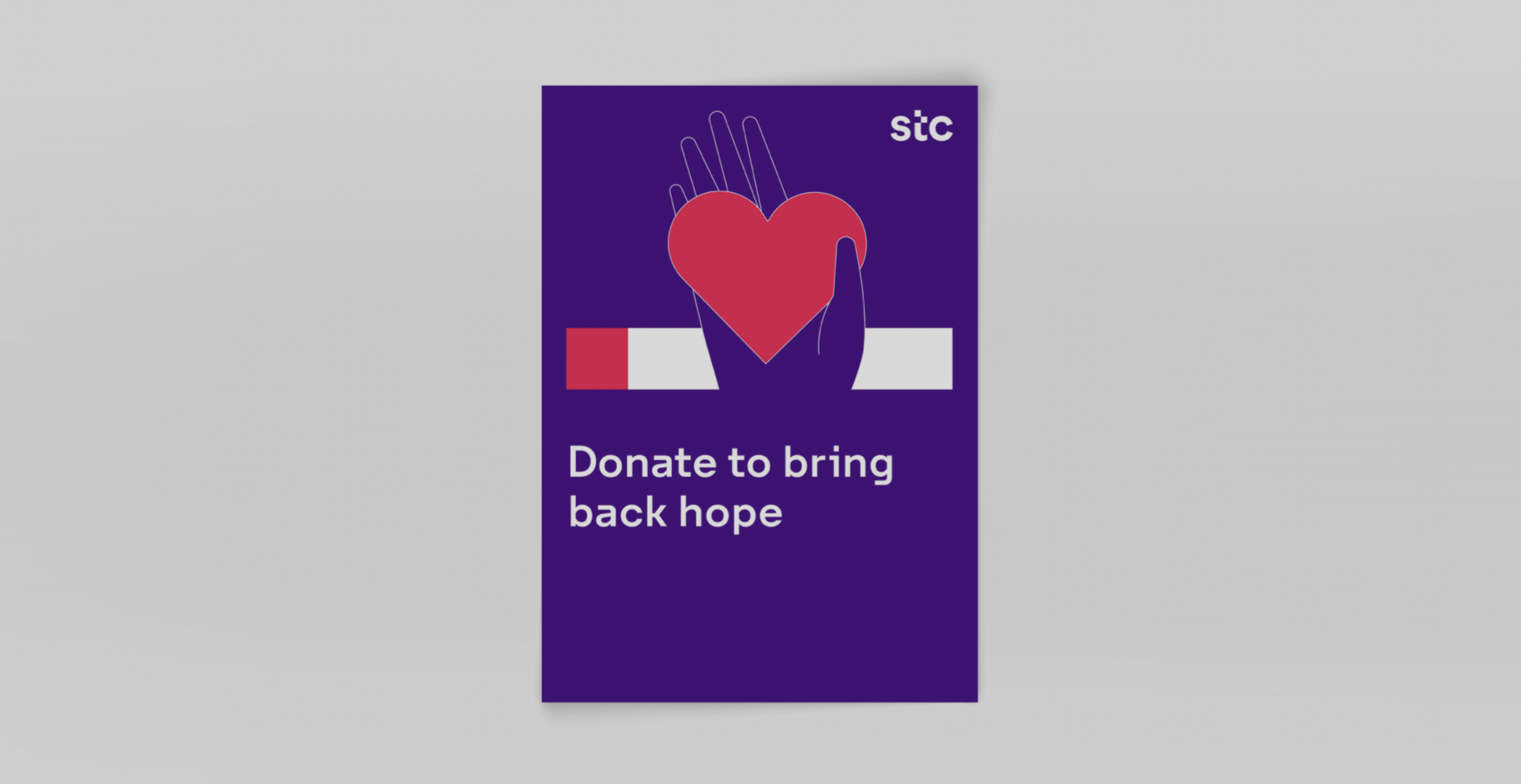
We decided to use one of the leading social media platforms in the country, Snapchat, as the center of our interactive idea. This idea revolves around an engaging design that showcases an employee, working in any stc office in any region in the kingdom, walking up to the KV we’ve created and taking his phone out. The employee scans the snapcode on the KV with his phone and is automatically redirected to the snapchat filter created for the donation. The donation made by the stc employee will be acknowledged within the app. This feature unites all stc employees throughout the Kingdom for the same cause. Our idea combines the goodwill behind donating and interactive experience that leaves the employee proud of his stc community.

In the snapchat filter, we used the hand movement because it embodies the act of giving. We used a globally recognized symbol of giving: a heart. Both conjoined resemble the art of altruism, gratitude and support.
Through Geofilter and snap ads, the snapchat filter will immediately redirect stc employees to the donation page.
The Geofilter is only available in stc offices, or other designated locations, for stc employees.


Nova Water KSA - Wunderman Thompson
Nova is one of the best and cleanest water in the kingdom of Saudi Arabia. The Client assigned us to design his delivery application which we designed magnificently. We created the best user experience possible for the customer whilst keeping a refine and edgy design reflecting Nova’s brand identity. Being the lead designer of the team, I wanted Nova’s brand identity to be a leading example not only in the Kingdom but around the world and this is what the team and I vouched to do.


Maximize your experience by downloading the app on Google Plus and Apple Store
Website Hiking Made Easy - Tourism Province Antwerp
The Province of Antwerp offers high-quality, accessible walking experiences. By providing tailored, future-proof and sustainable products and environments they want to promote, encourage and support walking in the Province for all. This service design project aims to design services, experiences and touch-points for the Province of Antwerp that inspire and guide people to walk.

Matchmaking hiker types to services, by changing the perspective and additional tailored experiences, supported by a revamped interaction style.
This project enhances services for hikers in the Province of Antwerp by addressing the challenge of scattered information online and offline and the lack of guidance. The solution involves a mood-based filtering system, a user-friendly interface for a hiker platform, and additional experiences to streamline access to hiking services and inspire exploration. The approach has resulted in a shift in perspective, supported by a revamped interaction style and additional tailored experiences.

Challenge: “How can we accurately reflect the hiker’s mood on our website?”
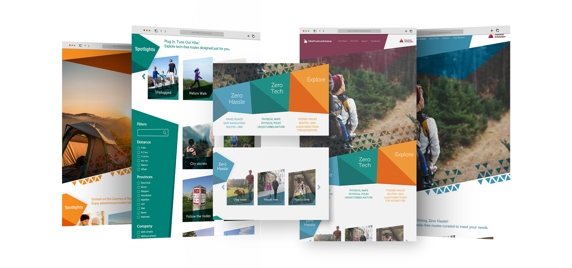
After investing considerable time researching other hiking websites, we observed that most neglect the environmental-friendly aspect of designing an ecological website. Furthermore, their search engines appeared scattered and disorganized. Consequently, a more precise search engine was chosen, ensuring users quickly finding their targeted hiking trips. We incorporated the three previously developed moods into the homepage in a clear and concise manner.
We created a user-friendly website with a focus on easy navigation and instant user satisfaction. Our design prioritizes key aspects like enhanced SEO for reduced energy consumption. Key benefits include lower front-end energy usage, fewer resources, faster navigation, improved search engine rankings, and increased user happiness.

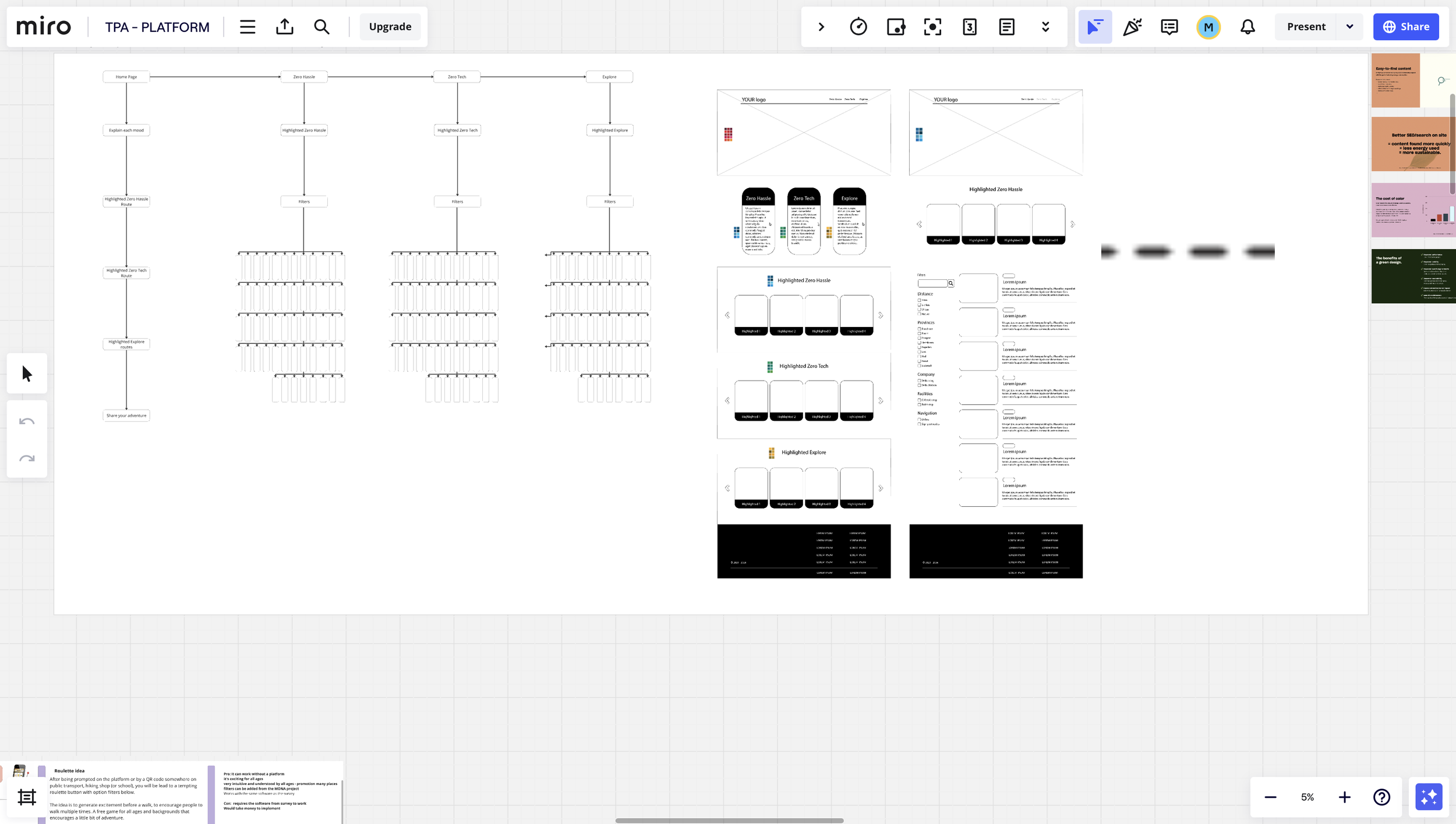
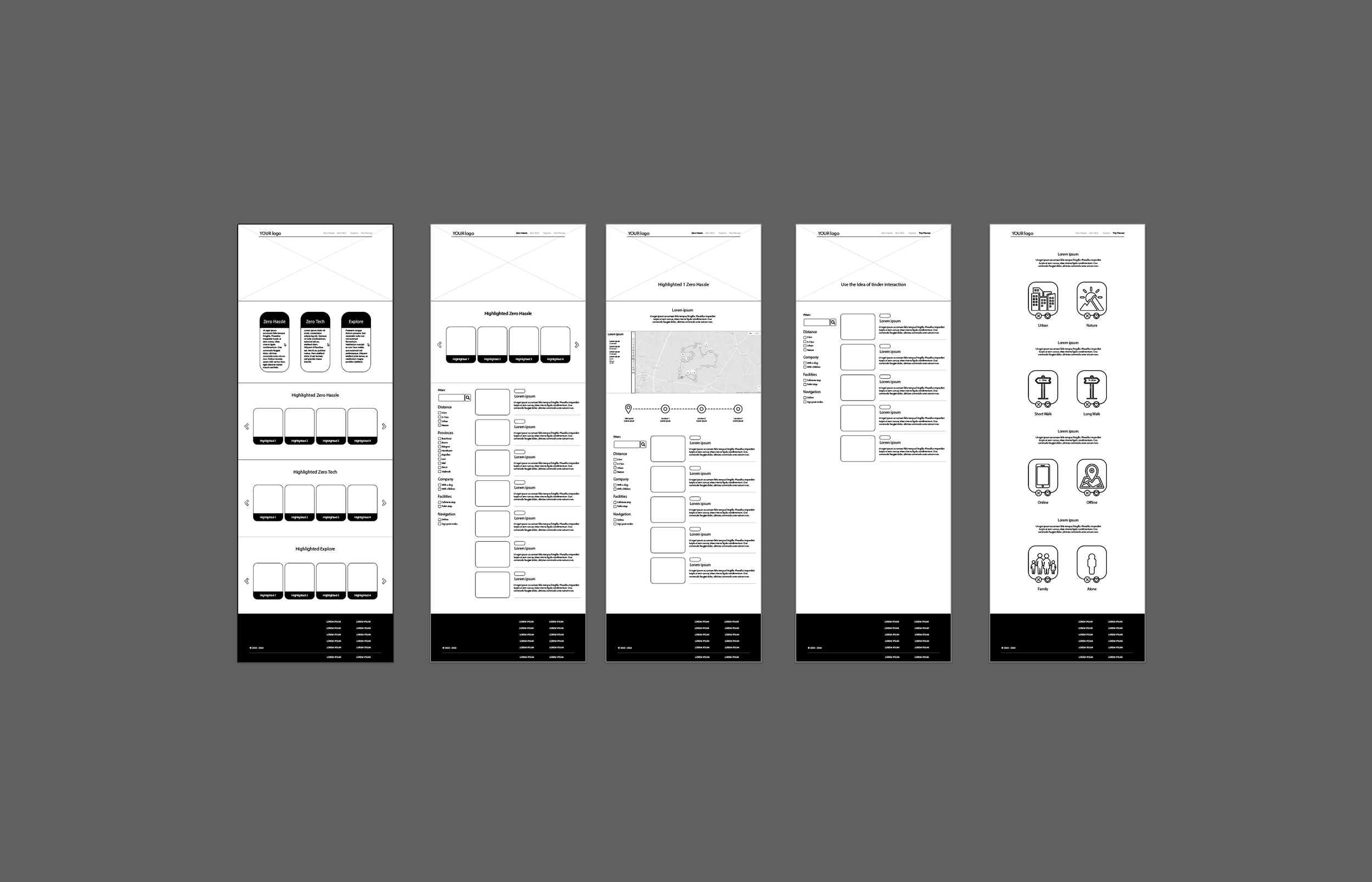
Users are only two clicks away from finding the best-curated hike for their mood. By scrolling, they have the option to directly click on one of the three moods. Upon clicking a mood, they are directed to the corresponding section with highlighted routes at their fingertips.
ZERO HASSLE SUBPAGE ONE
The first Zero Hassle subpage is linked to one of the suggested routes featured on the homepage. On this specific page, the user selected the dog route. The example highlighted earlier in the presentation is showcased on the website with a sleek design and various filtering options.
Research - Site Maps - Wire Framing - Prototyping
Softwares used (Adobe Ai - Ps - Miro - Figma)


